BLUSH FLOWERS
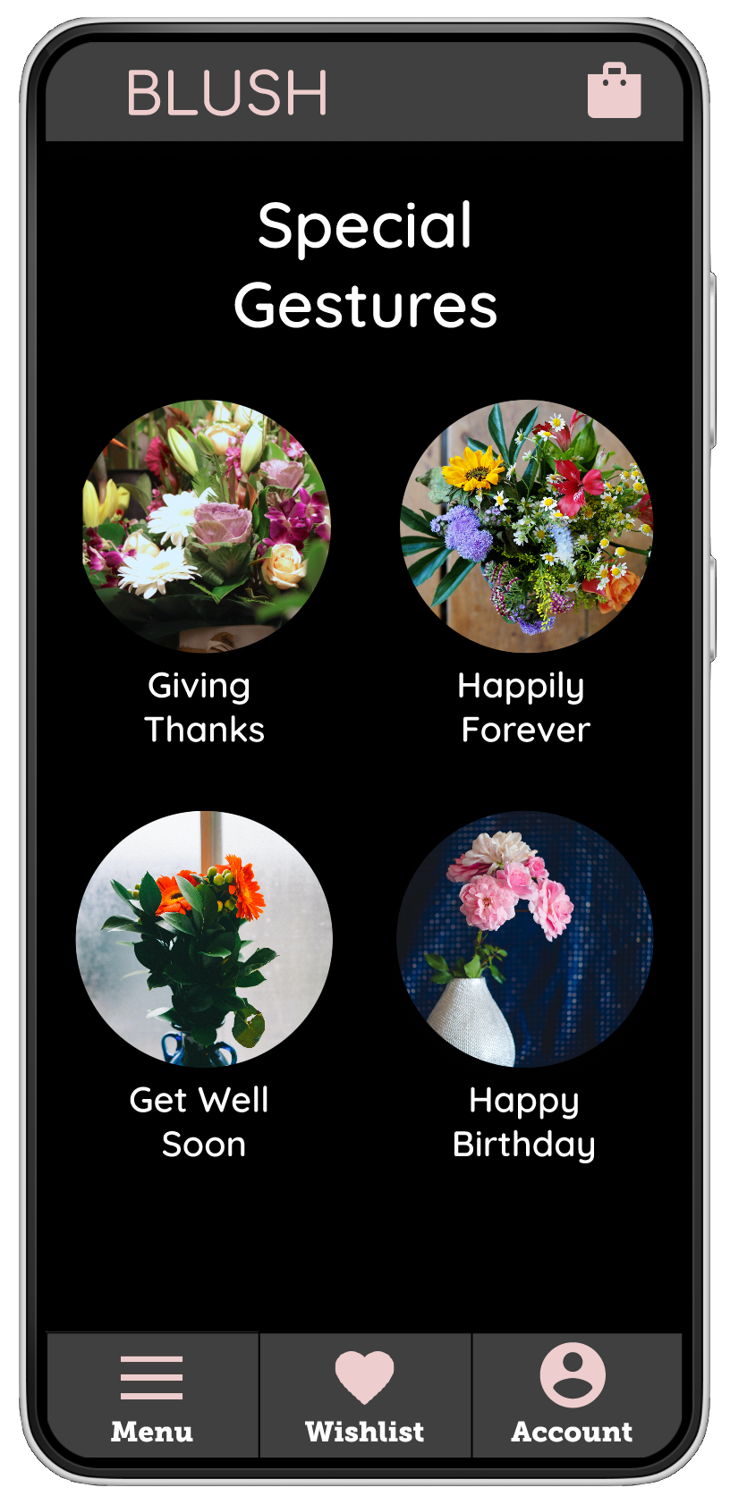
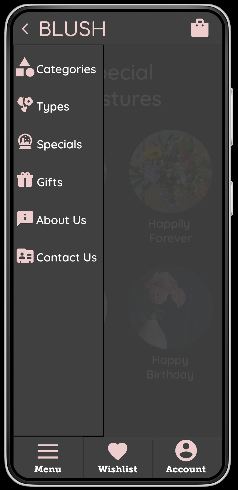
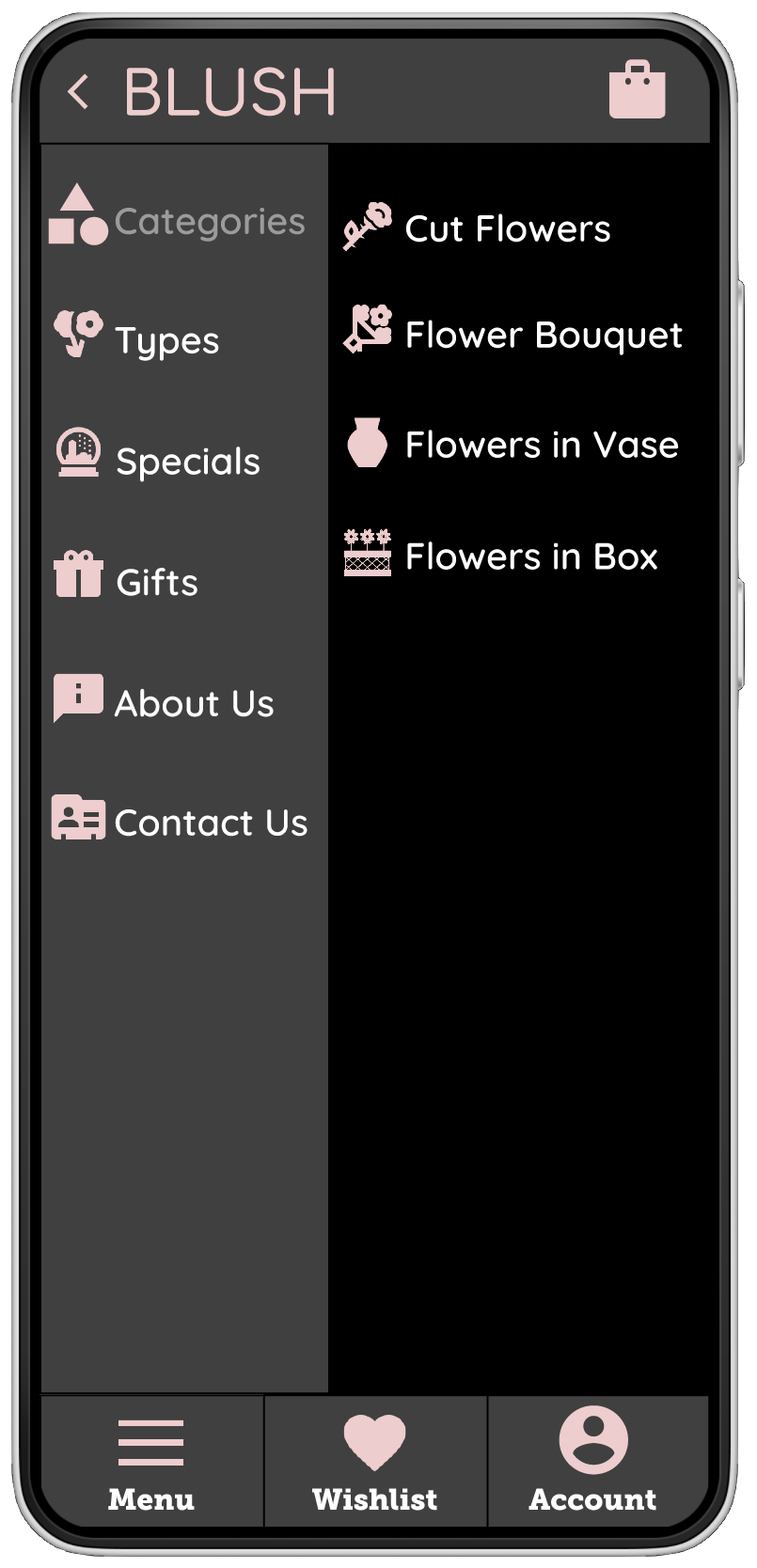
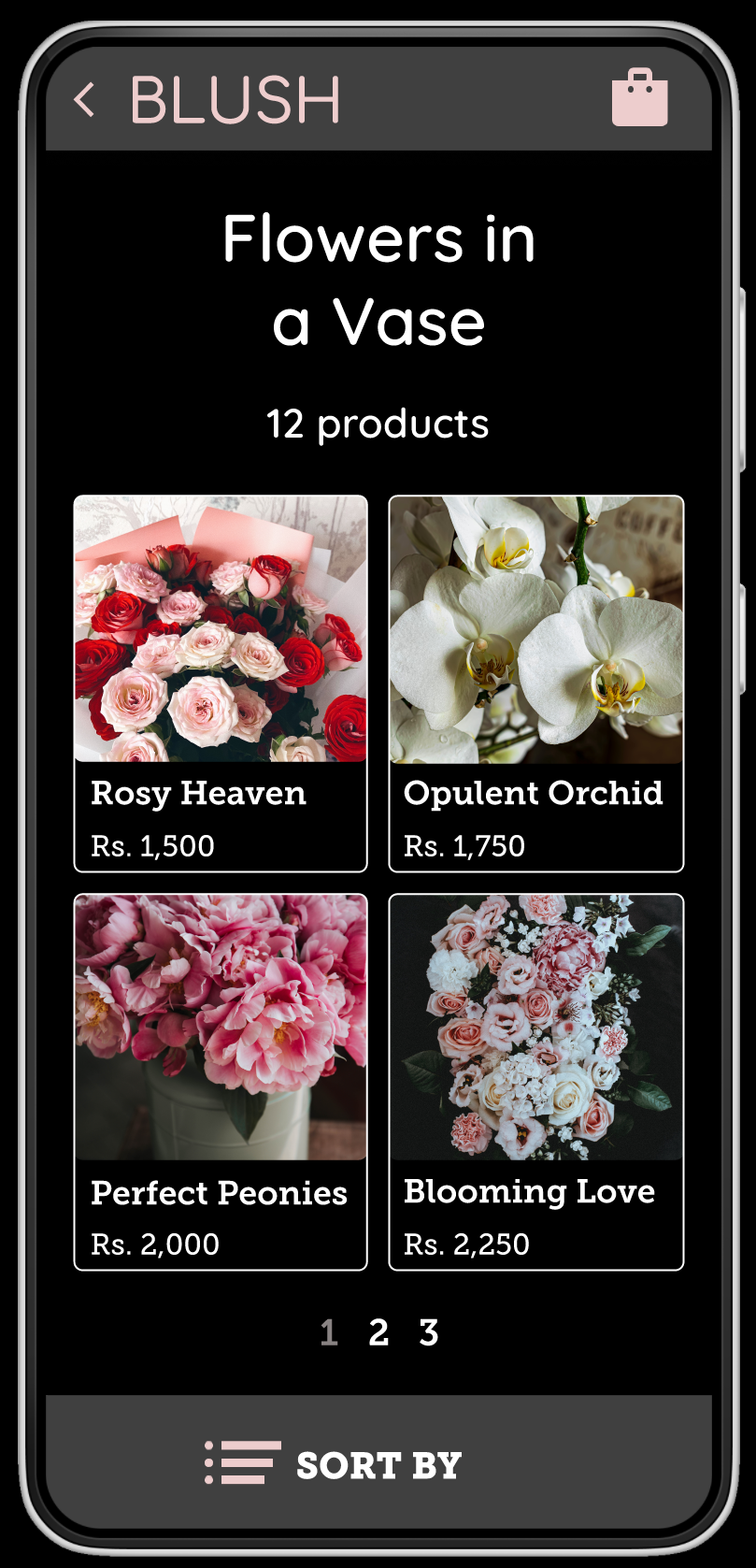
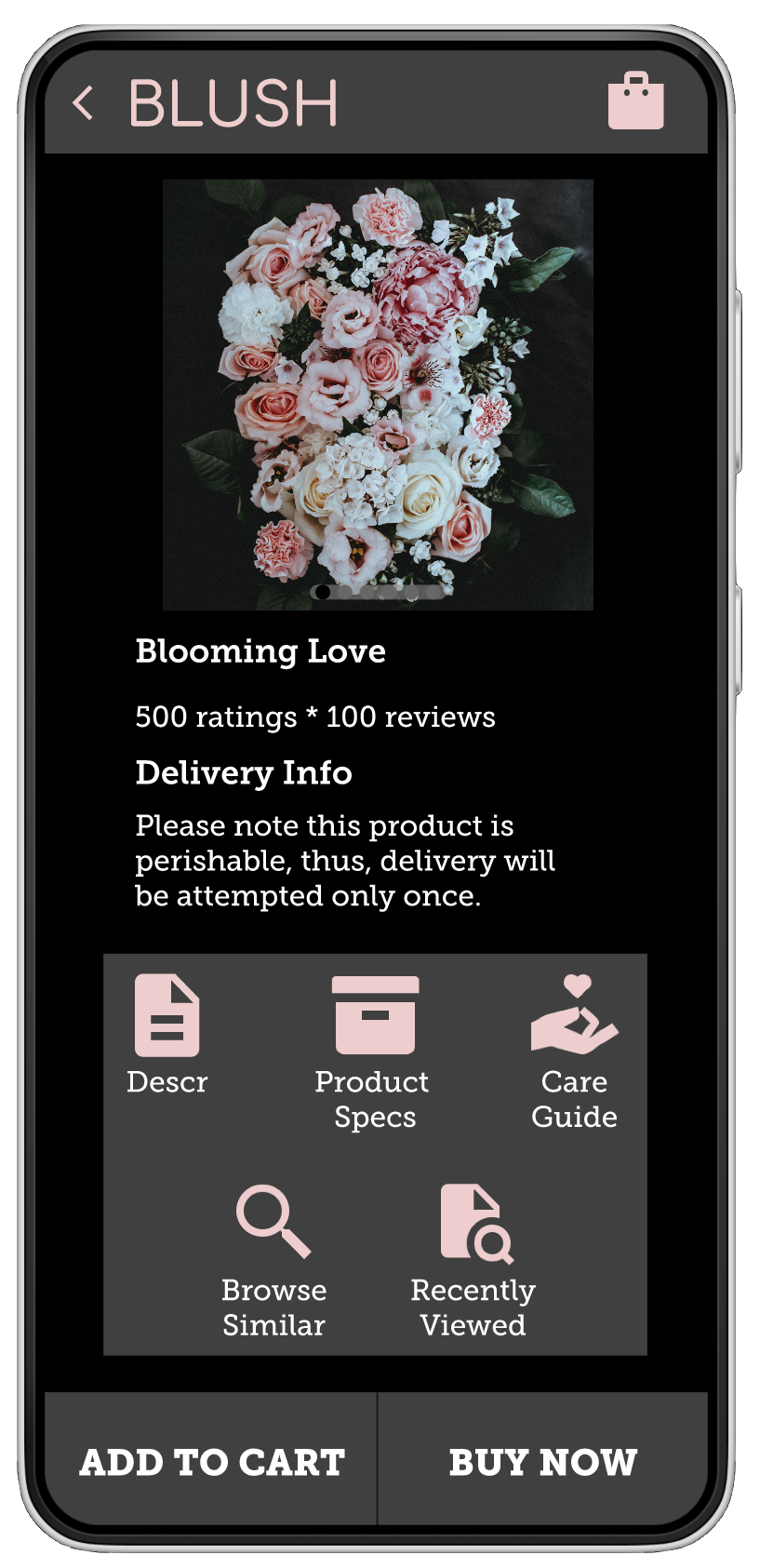
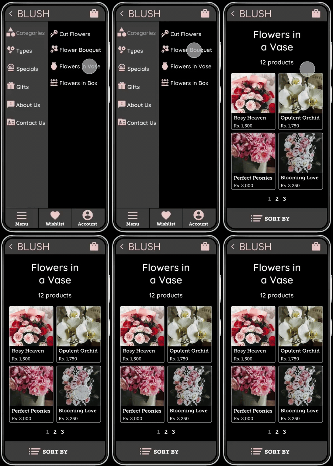
BLUSH is an aesthetically appealing flower catalogue and delivery app with a well organized layout, clutter free and seamless navigation designed for avid flower enthusiasts, including those with low vision.
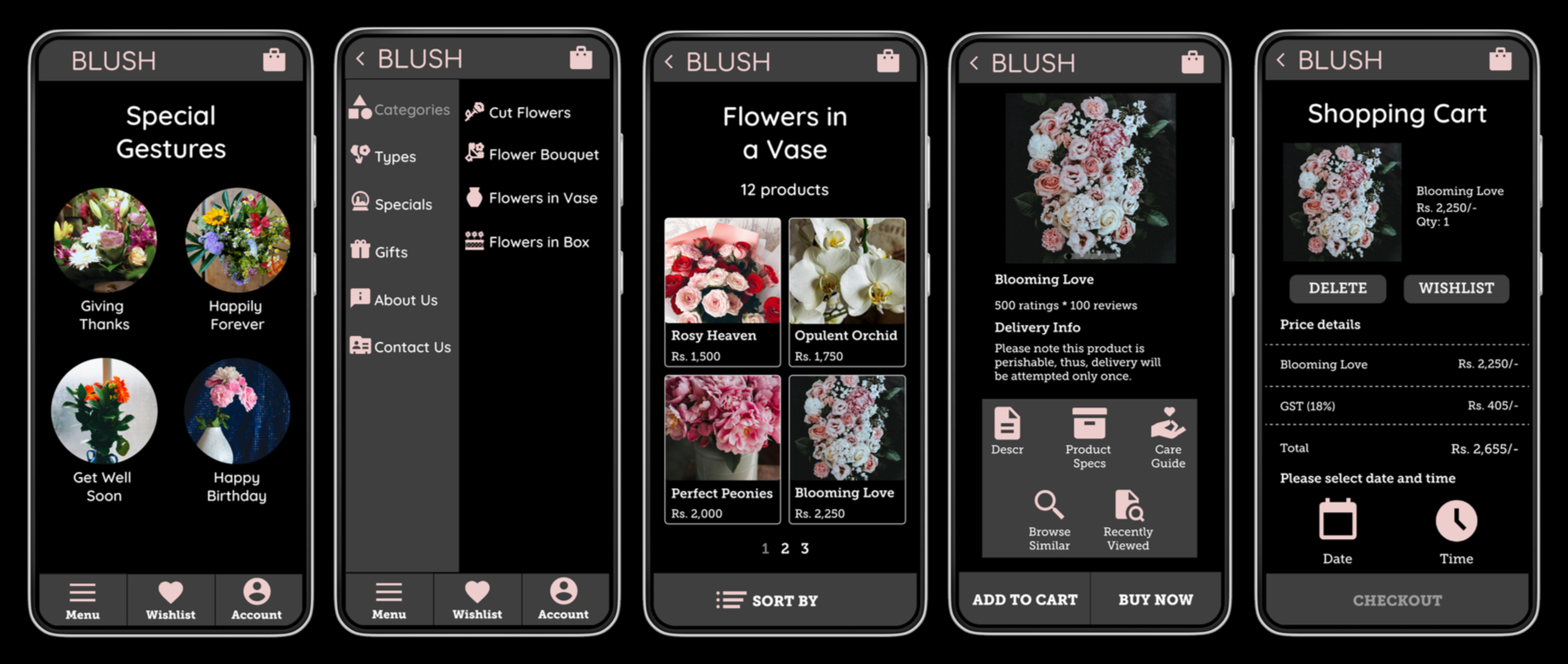
Based on user research conducted for flower delivery apps, customers encountered significant customer dissatisfaction regarding untimely deliveries, poor product quality, and inadequate customer service, especially during special occasions.
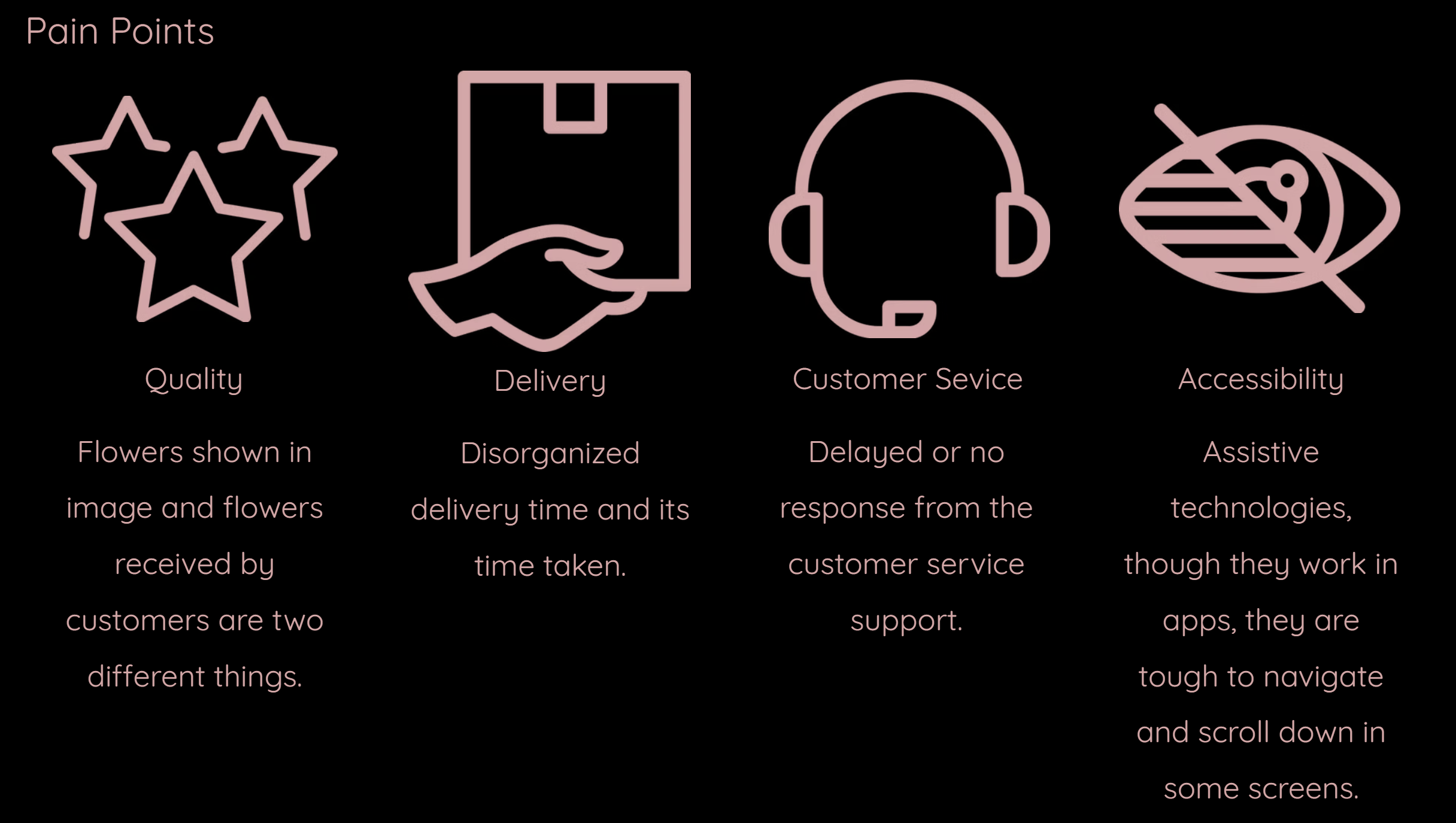
Pain Points
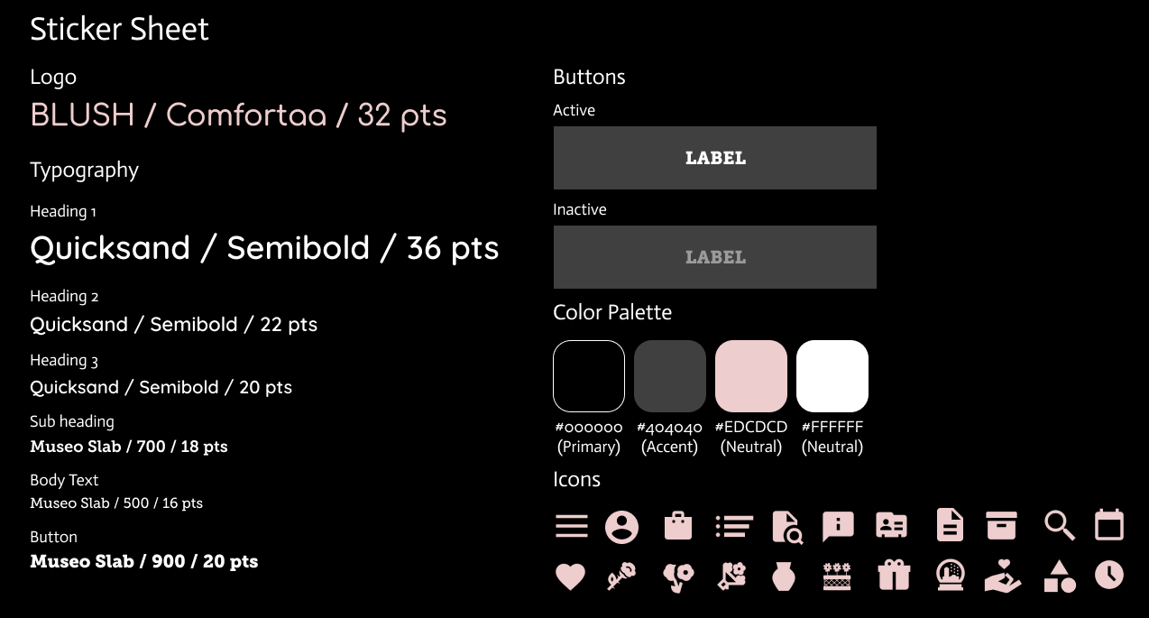
To encourage low-vision accessibility, the UI utilizes a high-contrast visual system with a black background paired with a gray, white, and pink color scheme. Each element—including buttons, icons, and magnified text—has a dedicated color assignment for enhanced readability and navigation. The elegant typography pairs Quicksand and Museo Slab to ensure a sophisticated aesthetic while maintaining clarity.
User Interface Design
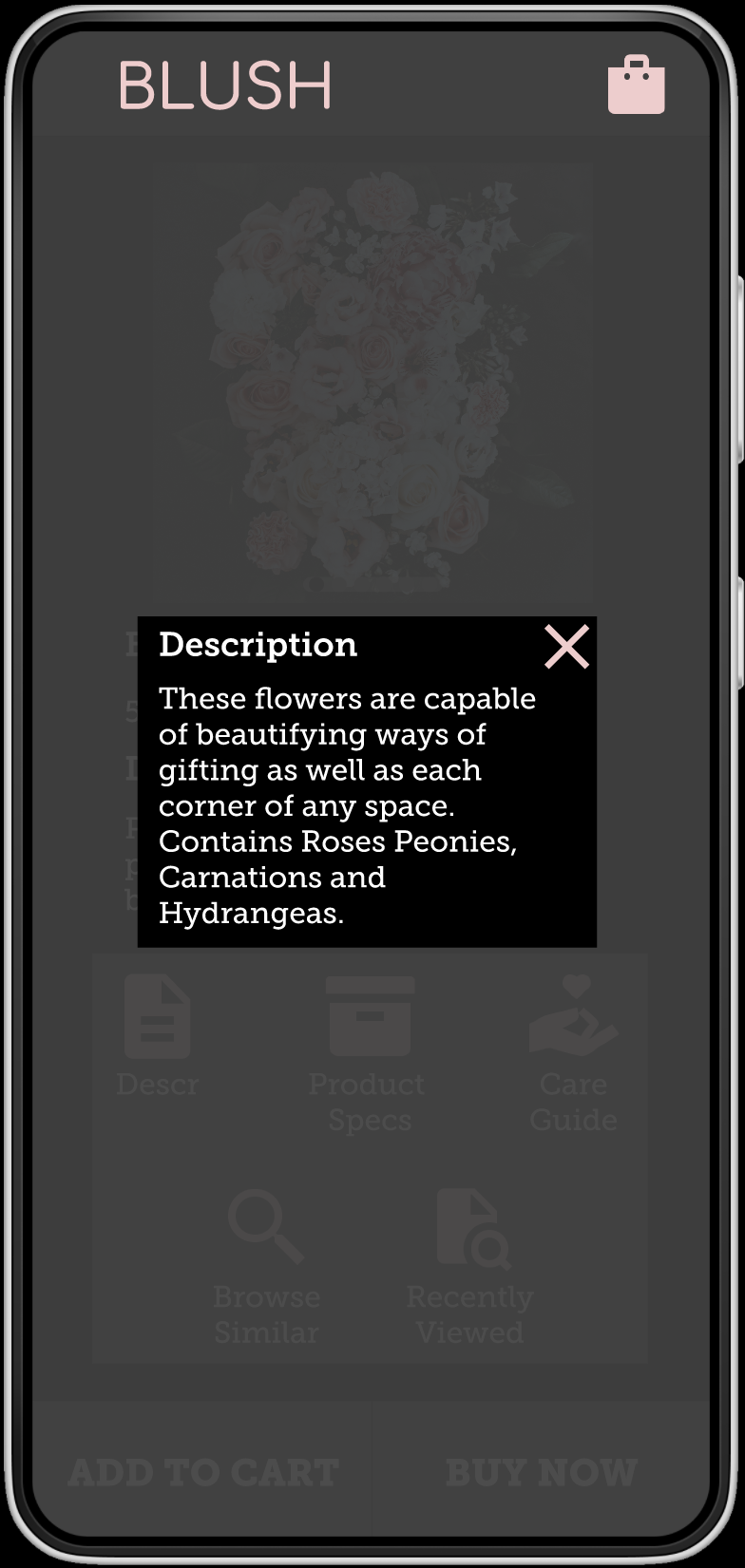
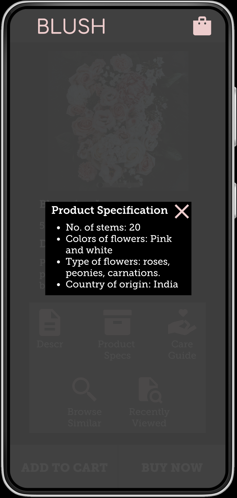
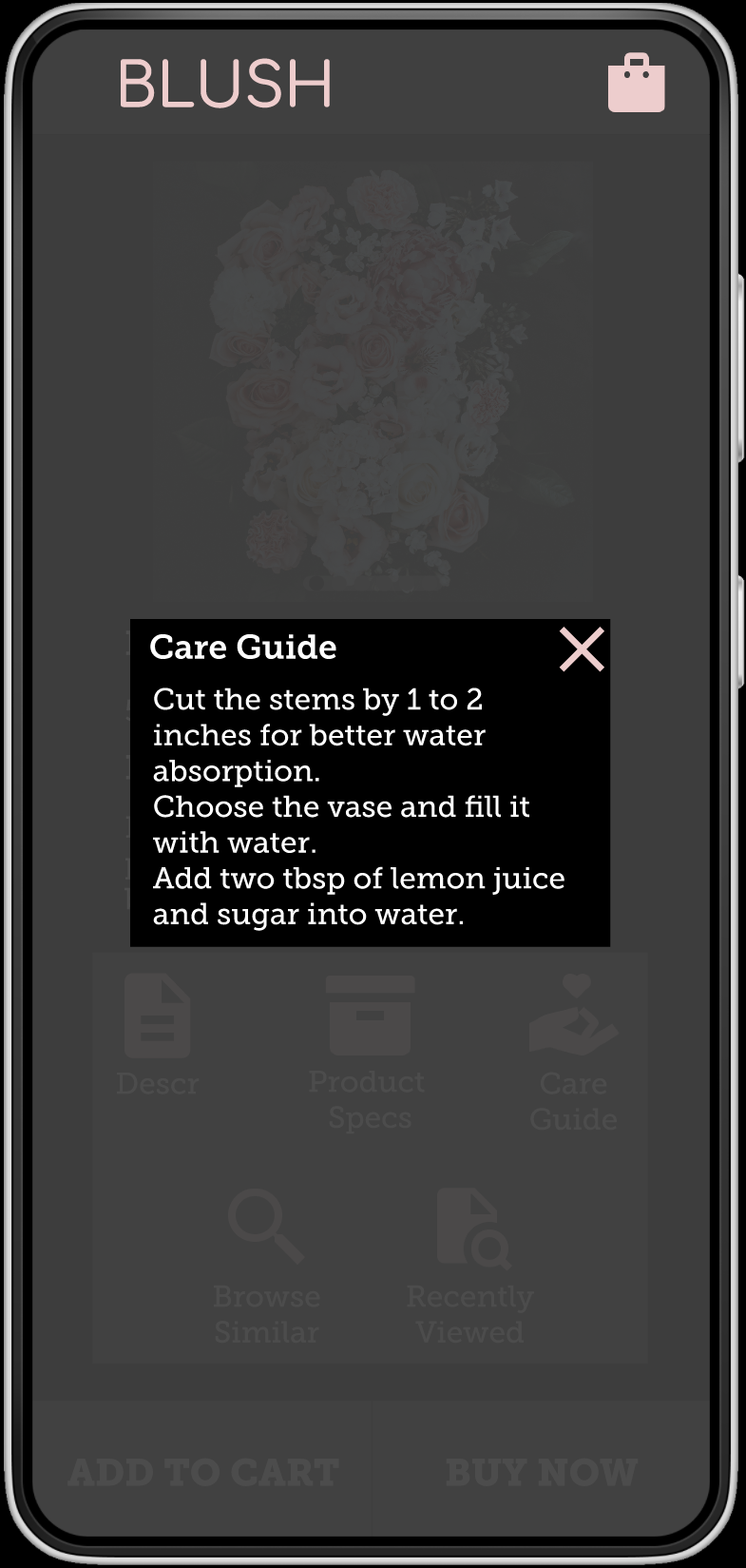
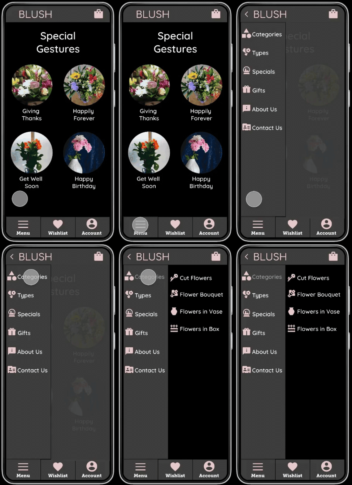
Condensed the entire experience into one main page and minimized buttons, icons, vertical and horizontal scrolling loops to curb cognitive overload for seamless navigation when screen readers are enabled. A high-contrast theme, magnified icons, and clear typography (Quicksand and Museo Slab) was optimized for low-vision users. Included clear, descriptive overlay windows to provide real-time guidance and feedback for users new to technology.
App Features
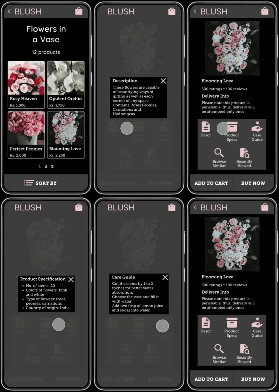
This application was designed specifically for low-vision users and those new to technology for ordering flowers for numerous occasions. User feedback emphasized on the use of the included floral care guide, providing instructions on maintaining freshness after delivery.
Takeaway